Last March, when our daughter turned three, we had her birthday party – and 35 people – in our 1965 split-level house. Quite a feat considering the size and layout of our home is not at all conducive to hosting large gatherings. There is almost nothing that I enjoy more than hosting and throwing parties. I thought to myself that next year, we are going to have a house that is ideal for hosting and living a modern family lifestyle. The very next day, I started shopping for a new house.
Making the Decision to Build
It had taken nearly eight years for us to renovate our current house to match our design vision. The more and more we thought about painting every square inch of woodwork and ripping out three more bathrooms (no please, no!), the more the prospect of a new build appealed to us. We love vintage homes with character and quirky features (um, my scrolly wrought iron railings in our current house had me sold with hardly a foot in the door), but all we were finding was 90s oak-laden colonials with ketchup and mustard dining rooms (hard pass!) in Cleveland’s west side suburbs, where we wanted to stay.
After much frustration and disappointment, we started to seriously consider a new build…What could be more perfect for us than a clean, white canvas?
Our Wish List
An abridged list of our must-haves:
- Lots of Space! This was at the top of the list. We wanted enough space to accommodate anything we might want to do in the house. Host both entire extended families for any holiday, have five more kids, house stray animals and people, not run into each other for two days, etc.
- Dedicated office space for me. Our 4th bedroom was being used as my office/makeup room, and I really wanted to have a dedicated workspace that I could make my own. We didn’t want to use up a bedroom on a workspace again.
- A True Master Suite. I’ve always dreamed of a bedroom retreat, a spa-like haven with a jetted tub where I could drink champagne and watch The Bachelor.
- A gourmet chef’s kitchen with storage space galore and plenty of counter space for entertaining.
- Mike’s personal wishlist: a three-car garage and space to create a speakeasy/recording studio.
- Spaces for Coco. A dedicated playroom, ample toy storage, a place for her and her friends to play safely and freely.
Finding the Right Builder + Floorplan
We found a neighborhood we loved in a location that was not perfect but we could make work, and a builder who we felt had enough flexibility to handle my crazy meet our specific design needs. In the end, we decided on Drees Homes and after much consideration, landed on their Buchanan floor plan. The main reason we’re building is that the house conforms to us, and not the other way around, and this floorplan checked off many of the boxes on our extensive and daunting list of must-haves.
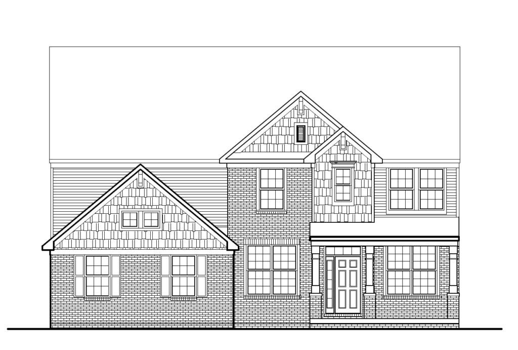
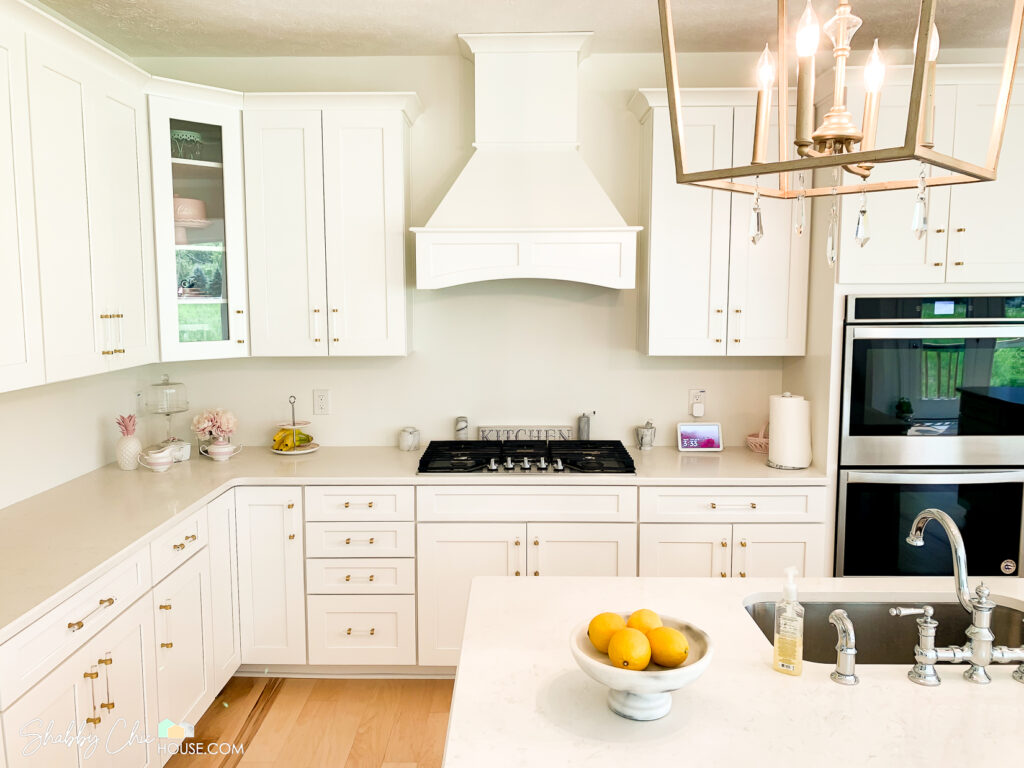
So we chose the largest lot that was available at the time and signed the papers on July 31. At the time of signing, you have to choose all of your structural options. So any extra windows, a finished basement, adding a sunroom, etc., and the configurations of certain rooms, like the kitchen and master bath. We opted for the designer bath option in the master which would add a spa tub and a large shower with a bench. Also, we opted for the gourmet kitchen, which gives you double wall ovens and a gas cooktop.
Another customization we got was to add a “family foyer,” which is the space when you come in the house from the garage that has a storage bench and hooks for hanging coats, purses or backpacks, and a place to put on and store shoes. There is also a nice sized storage/coat closet and a powder room in this immediate area. For someone who loves organized living, this space was key!
We also opted to add a sunroom off the kitchen and with this option came an additional peninsula of cabinets and counter space. When I realized this would be the most perfect place to display party appetizers and desserts and a bloody mary bar to rival all others, all I could literally do was swoon. My party house dream was materializing on paper.
Making the Initial Selections: Interior
Next came the really fun part: the Design Center process. I didn’t lose my mind or end up in the ER with heart palpitations and chest pains twice during this process AT ALL.
So, Drees gives you 30 days to visit their design center and choose all of your finishes. You work with one designer there and she takes you through each option for each room and the exterior selections. We had our first meeting in mid-August with the intention to have all of our selections made by August 30 (LOLZ), as selections need to be signed off on before breaking ground. This would not happen in a timely fashion for us because we had a hard time committing to, well, pretty much every last detail.
We had a very specific design vision for this new house: White. We wanted everything to be as white and bright as possible. Here are my Top 3 favorite design Instagrams where I drew my inspiration…
- The Leslie Style – Everything this woman does is the most gorgeous thing I’ve ever laid my eyes on.
- Randi Garrett Design – This designer’s use of gold & pink is perfection.
- The Pink Dream – Can you say NetteF’s design soulmate?
Heads Up: ShabbyChicHouse.com uses some of the best products and often has spent hours researching, reading reviews and carefully selecting the products used in our projects. In our posts we have shared these products via affiliate links. If you buy something through one of these links, you won’t pay a penny more, but we may get a small commission which helps us keep the site up and running and bringing you new and awesome content.
Mike and I love gorgeous plumbing and lighting fixtures, richly veined marbles, the use of wallpaper, and wainscoting, wainscoting, wainscoting. We plan to wainscot this house until it cannot be wainscoted any more. Santa even brought Mike this Metabo Finishing Nailer for the many projects ahead. So we really had to think through each detail of each room and figure out meticulous details from tiny samples and pictures in catalogs.
Some main items we decided on were Timberlake New Haven Painted White for all cabinetry, Calacatta Vicenza Quartz for all countertops and an Engineered Maple Floor throughout (not pictured because we changed it after this photo was taken at the design center).
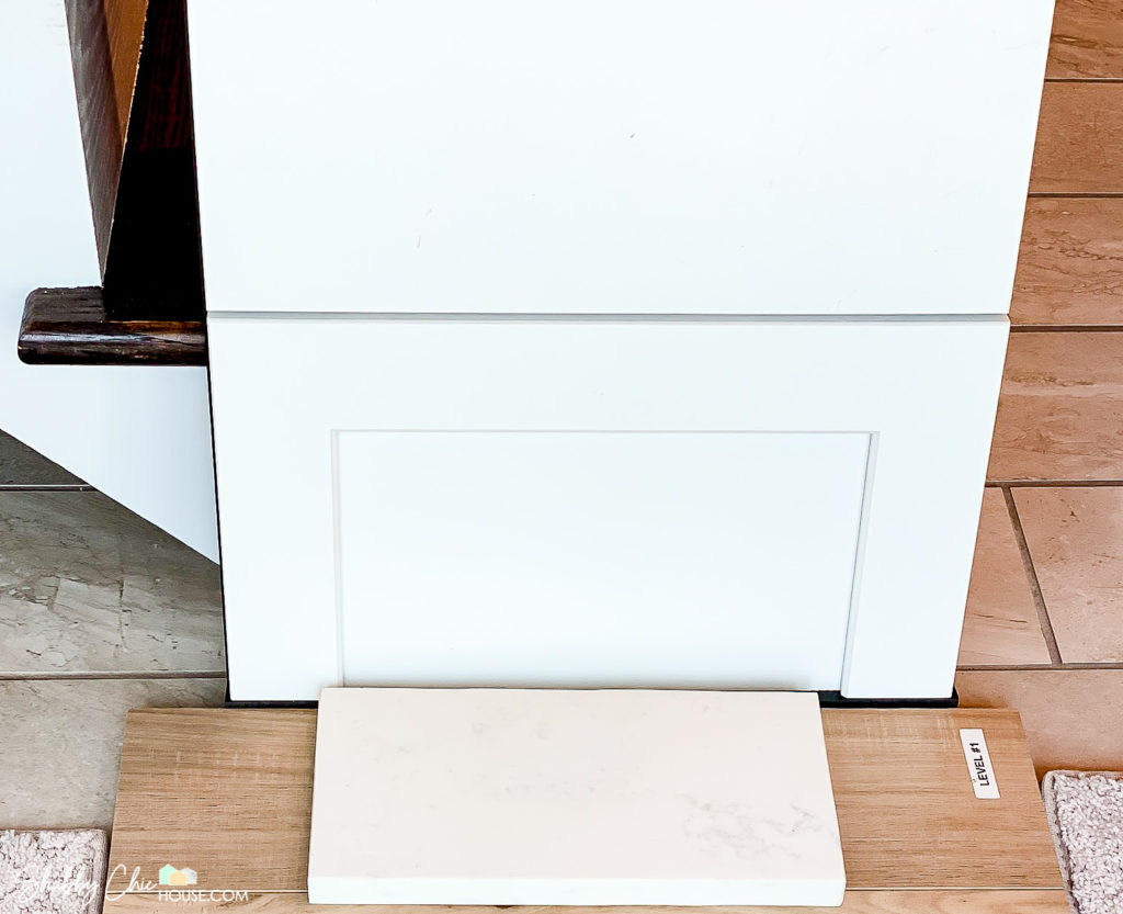
Because these details were so important to us, we took the extra time to drive to the many tile, flooring, plumbing showrooms and found each of our selections. For the tile in the master bath, it was a very good thing I did this!
One important example of this…At the Design Center, we chose Daltile Marble Attache Calacatta from a sample board for the master bath floor, shower and tub deck, and it looked very white and crisp in that sample, but when I actually went to the Daltile showroom and looked at several pieces of it, it actually had more gold, browns and beige veining – not what we wanted at all. And this was truly an element that we’d have been stuck with, so it was very important that we got this right.
This Daltile showroom had another color in this same line that Drees didn’t have a sample of in the showroom – Marble Attache Lavish Pearl Arabesque – and it was beyond perfect! Check out the rich grey veining in this one.
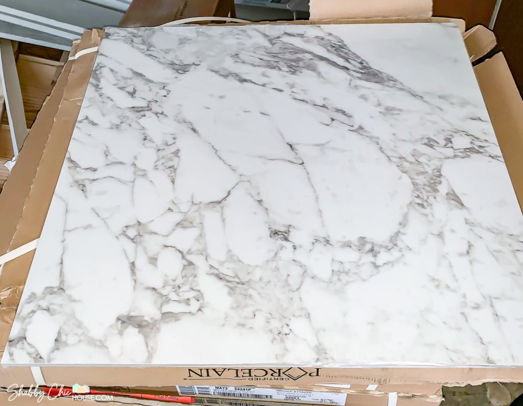
It was just what I wanted, but I didn’t know that was an option with Drees’ tile vendor. If I didn’t go to the showroom, I wouldn’t have known this was an option and my master bath would not have been what we wanted.
Making the Initial Selections: Exterior
Another painstaking decision was the brick for our exterior. This is the elevation we chose, which meant we needed to pick a brick, siding, shake, trim and a roof:
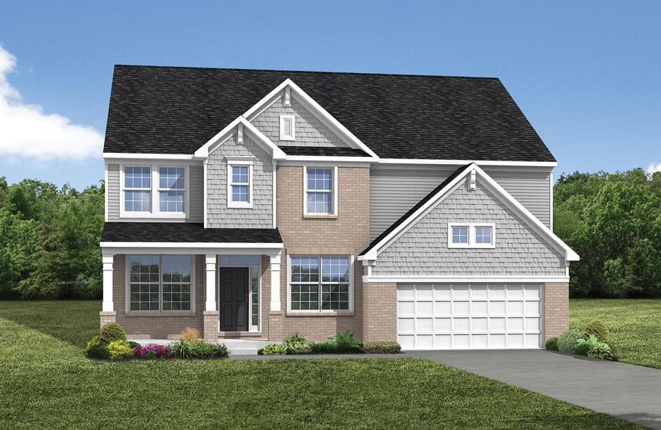
On the first day at the design center, we chose a white siding, white shutters, light grey shake, a grey-black roof and a brick called Winstar. Our design board looked like this:
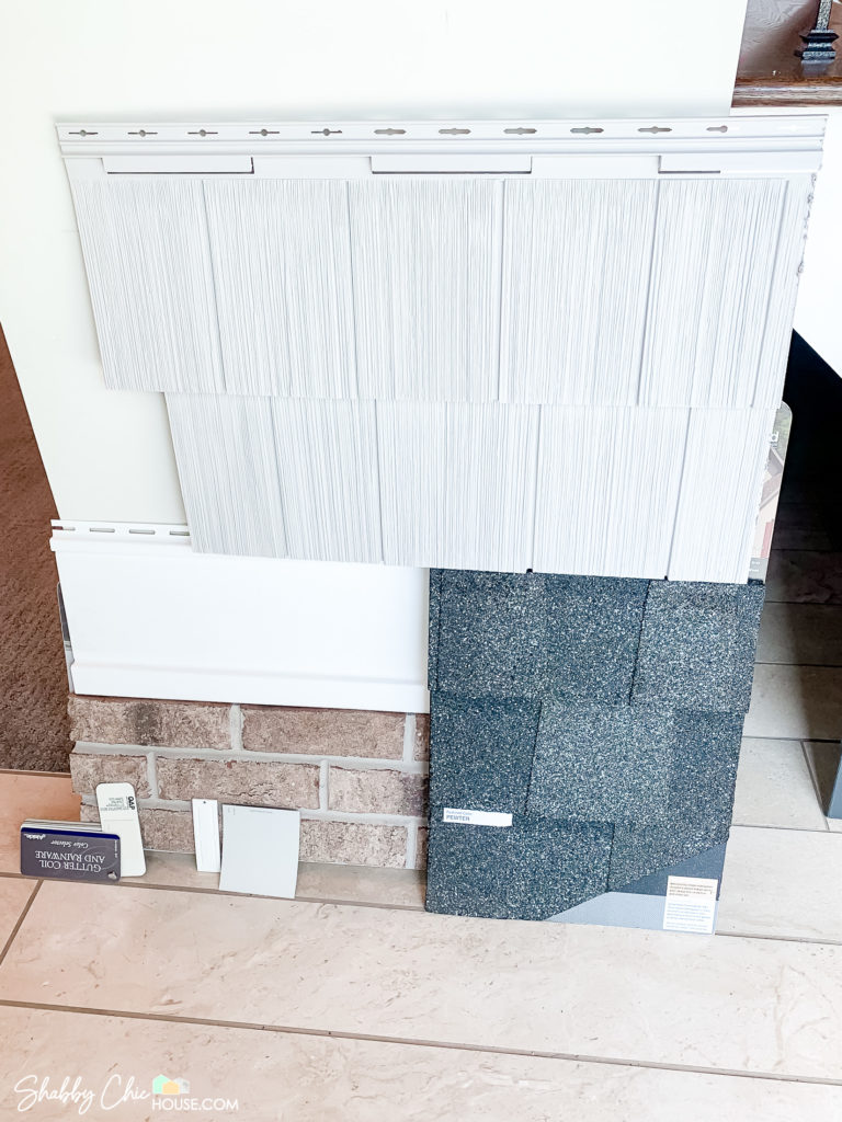
We immediately got nervous and knew we had to get the exterior right the first time, so we hopped in the car on the rainy Saturday of Labor Day weekend. From there, we proceeded to drive to every Drees development in Northeast Ohio and creepily ride by all of the houses with brick we liked, wrote down the addresses, and when it was all over, we ended up changing the brick and actually the whole exterior palette!
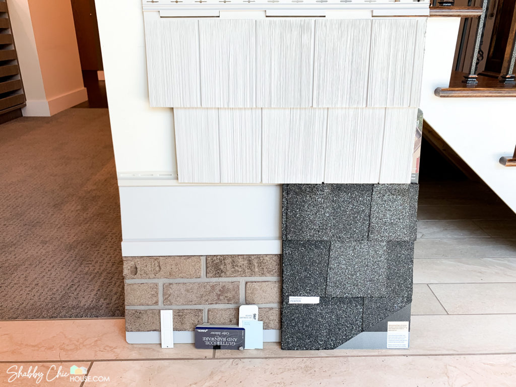
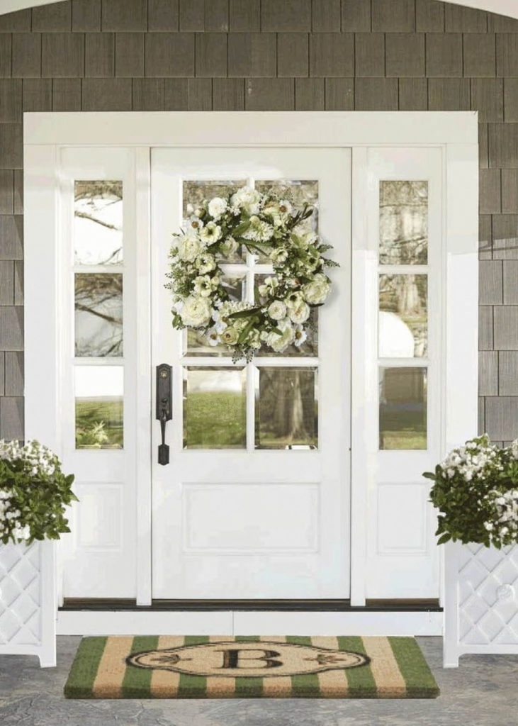
After all, we settled on a pinkish, whitewashed brick called Castleton, light grey siding and shake, and bright white trim. We went with black exterior hardware and these super adorable Chip & Joanna-ish black light fixture. And one of the things we are the most excited about is our front door. We chose a six glass panel door as the icing on the cake. We decided on black hardware for the outside door handles and will keep the front door white – see pic below! The exterior look is very coastal, Nantucket-y and we are SO excited to see how this comes together!
What’s Next…
As of early March, the house has been framed, the roof is on, windows are in, and HVAC, drywall is up, and electrical and plumbing are installed. We’ll be writing a joint post on the building process up to this point, and more detailed posts about the finishes as they go in over the next two months.
An Update on the New ShabbyChicHouse
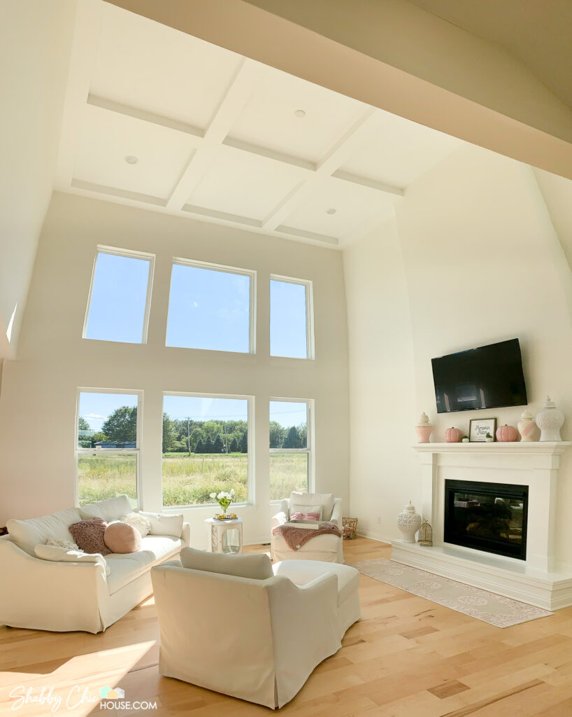
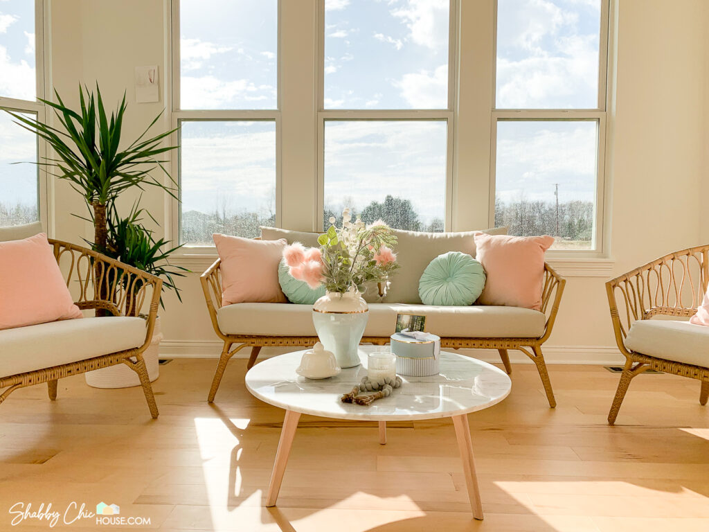
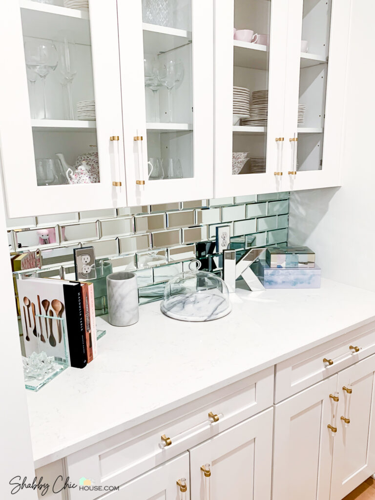
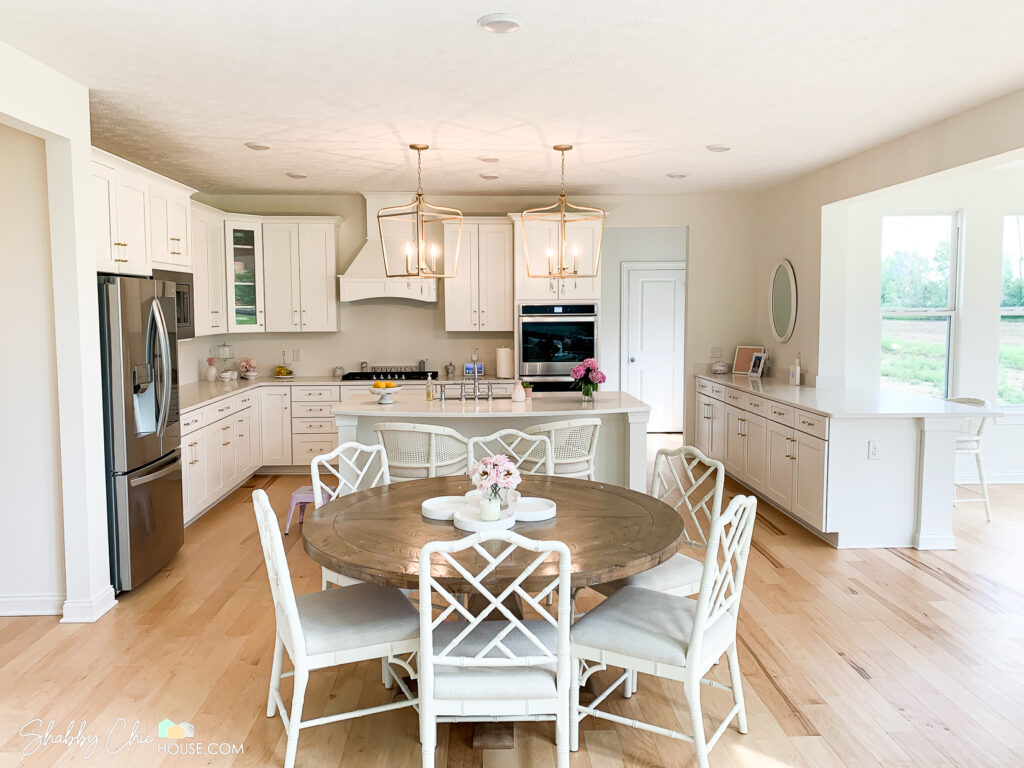
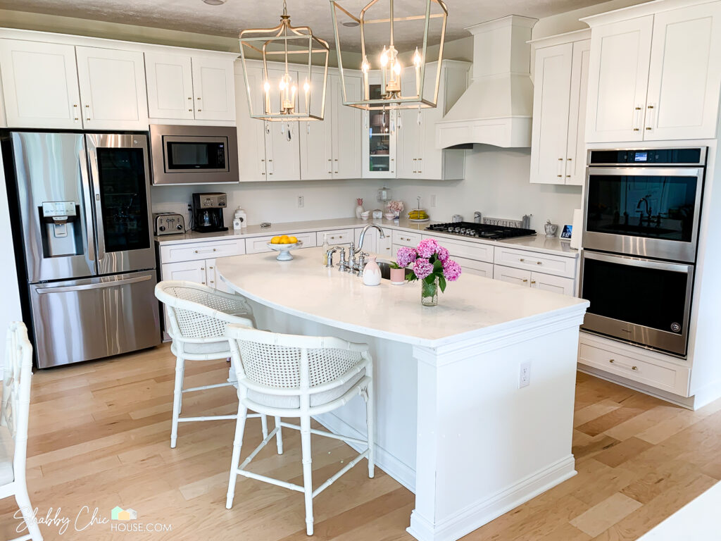
Our new house is complete. We’ve made the move and have been settling in nicely. Below are a few photos and our brand new blog post introducing the New Shabby Chic House. Check it out!
The New Shabby Chic House & 7 Upcoming Home Improvement Projects

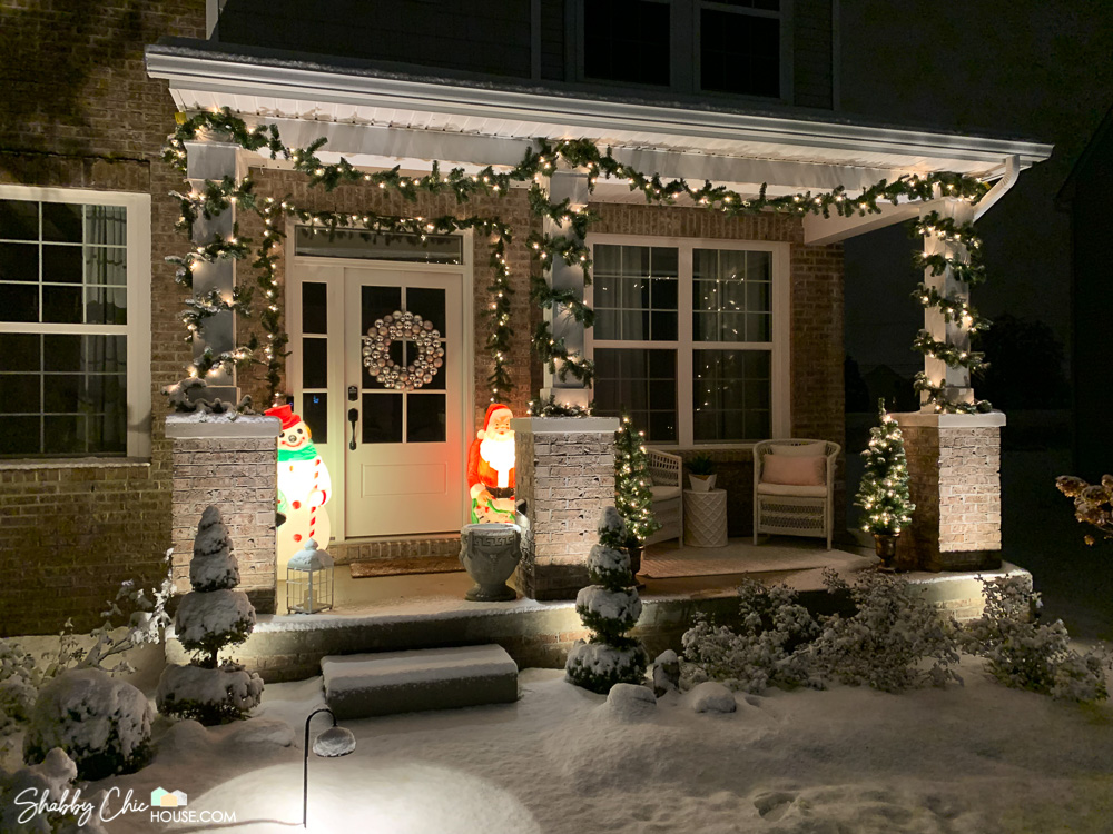
I need this front door! Where did you get it, what’s the brand? I’m Trying to rebuild My house that was devastated by Hurricane Laura.
Thanks!!
Hey Holly,
Sorry to hear about your home! Check out https://vistagrande.masonite.com/. Home Depot & Lowe’s are both Masonite dealers, so you might be able to get one through them.
Thanks a lot for visiting and commenting!